The Secret of the Fourteen Herbs
Industry
Spirits
What we helped with
Brand, Portfolio Architecture, Packaging design, Structural Design, Technological Enhancement Consultancy

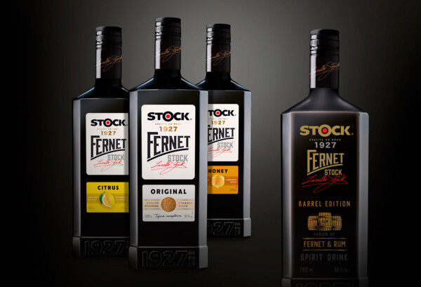
New age of the traditional Czech icon
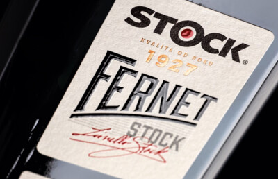
The clean design of the new Fernet Stock, the labels and the new logo refer to the brand's core values: honesty, craftsmanship and handmade. For the first time in the drink's history, the bottle has been given an edge, strengthening the brand's perception as more modern, more premium and better reflecting the distinctiveness of its unique and unmistakable bitter-herbal taste.
At the same time, previous typical and identifying features such as the massive base and wider shoulders have been retained.
The design allows both flexibility of solutions across the product portfolio and communicates a story of craftsmanship.